ACTIFY
Social Network Website
CHALLENGE
The client approached us with a request to redesign their website - a social network for people who want to find interesting things to do in their area. The challenge for us was to analyze the old version on the site and find ways to make the redesigned version more friendly, engaging and inspiring. The complex user experience of the product needed to be simplified and smoothed out. We also needed to come up with a comprehensive search and filtering engine to make looking for and browsing through activities easy and intuitive.
OUR APPROACH
We carefully analyzed Actify’s background, the field of application of the product, the competition and the newly re-designed mobile iOS application, and realised several important things. Actify’s user growth highly depended on their website - one of the main means of presenting the company, presenting the content and driving traffic to the Actify iOS application. The old design had been implemented some time ago and the look and feel of the website seemed somewhat outdated and did not fully follow the modern trends.
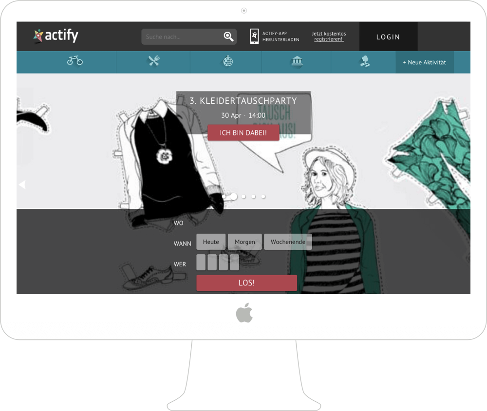
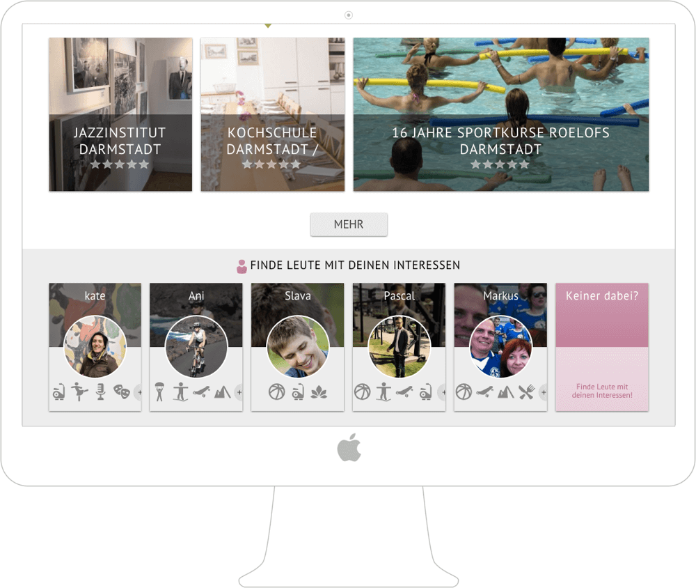
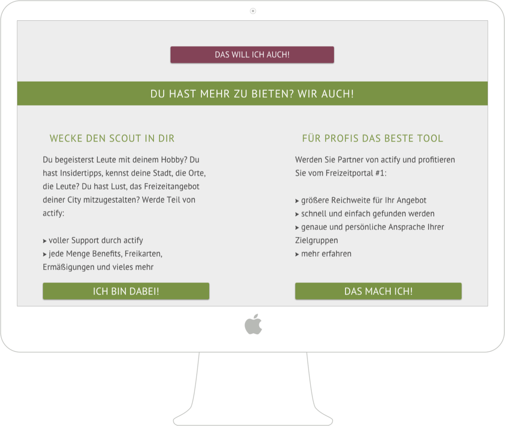
In addition, in view of the recent design changes done to the mobile application, the old website’s design and content did not fully correspond to the style and content of the mobile application.
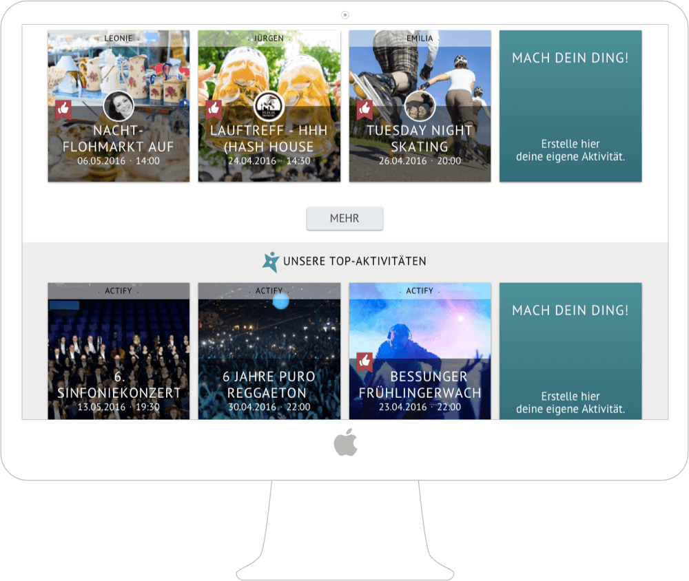
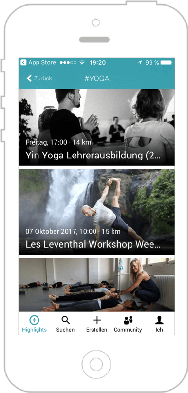
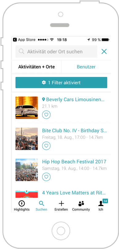
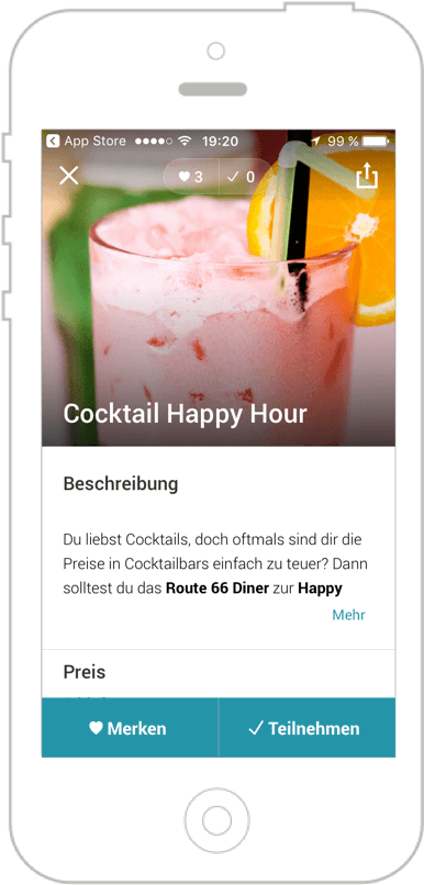


A high impact website was necessary to effectively reach the company’s goals, gain new users and provide an edge over the competition. For all of the above reasons, redesign of the website (such as significant structural, visual, stylistic changes) was recommended to the client to ensure that all the company goals were accomplished by the website effectively.
RE-DESIGN GOALS
- — Make sure that the style of the website and its content fully corresponds to the style of the mobile application (visually, structurally, and stylistically);
- — Make sure that the website presents the company to new users and potential partners in an effective way;
- — Make sure that we website offers relevant information and the content is presented in an optimal and effective manner;
- — Make sure that the website effectively converts visitors and drives traffic to the mobile application;
- — Make sure the website provides current and potential clients with the means to contact the company.
OUR PROCESS
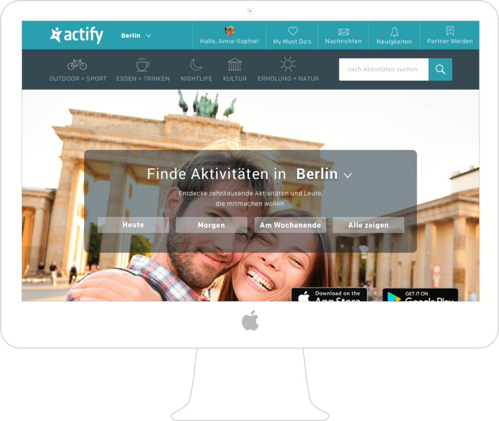
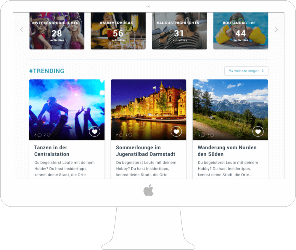
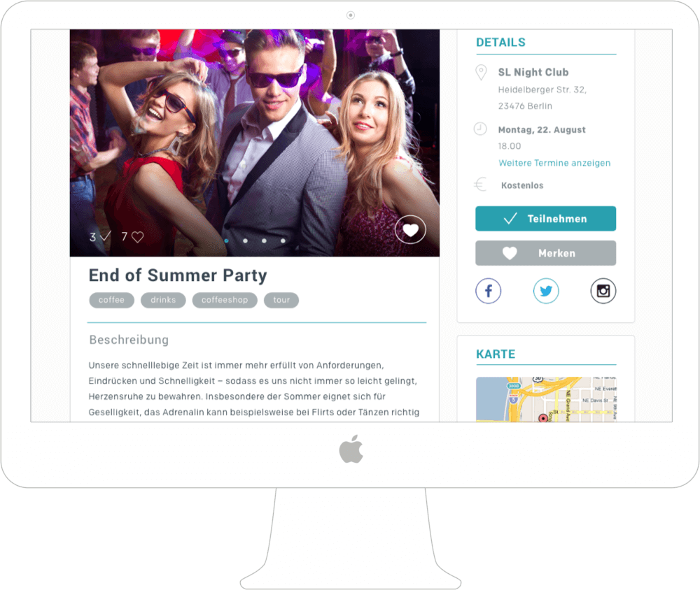
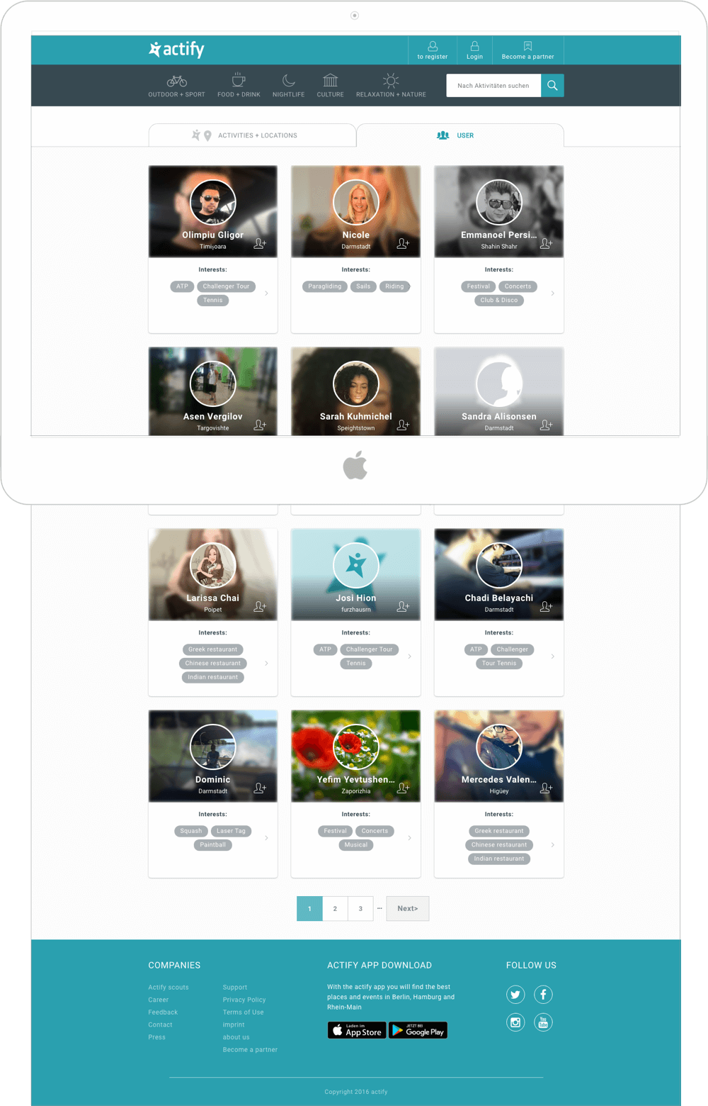
We conducted extensive research of competitors and noted what was done well and what wasn’t. As a team, we also brainstormed ideas of how to improve the existing look and feel and the user experience of the website. After carefully analyzing we decided that the several main points needed to be improved. User experience needed to be simplified and made more user-friendly. We decided to remove visual noise, remove unnecessary elements, consolidate repetitive elements into coherent logical clusters, design and implement a comprehensive easy-to-use search engine, reorganize information architecture of the site. To make the website’s look and feel more modern it was necessary to remove drop shadows, redesign icons, change button styles and font treatments.
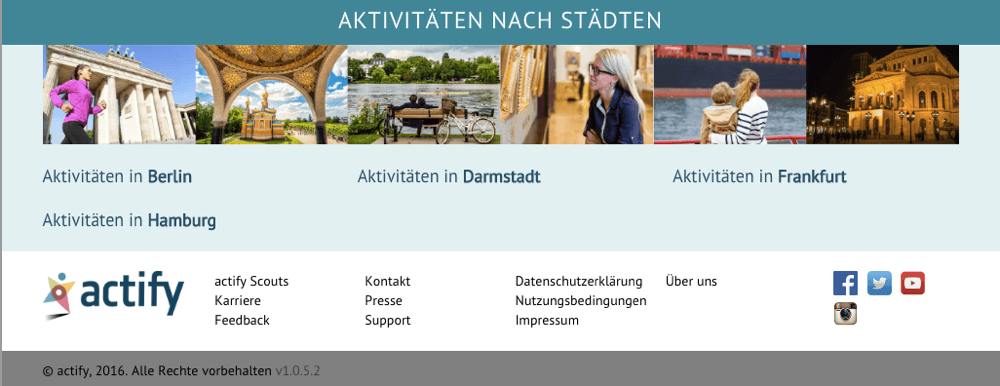
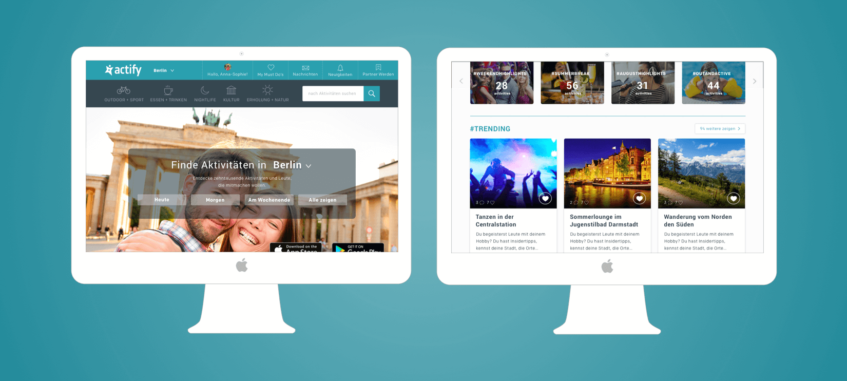
It was highly important to the client to make the new version of the site more inspiring. To achieve that goal we made a decision to use more engaging images, high-quality inspiring photography. Implementing design edits to buttons and other design elements - like adding rounded corners and more circular elements would make the overall look of the site more friendly and approachable.
SOLUTION
The recommendation was to rethink the structure and information architecture of the website and implement certain stylistic changes in order to make the website look fresh, modern and clean. It also seemed important to make sure that the design of the website is consistent with the design of the mobile application. A strong emphasis was to be placed on improving the user experience of the website in a way that presents the company in the most effective and convincing way possible, as well as attracts and converts new users.
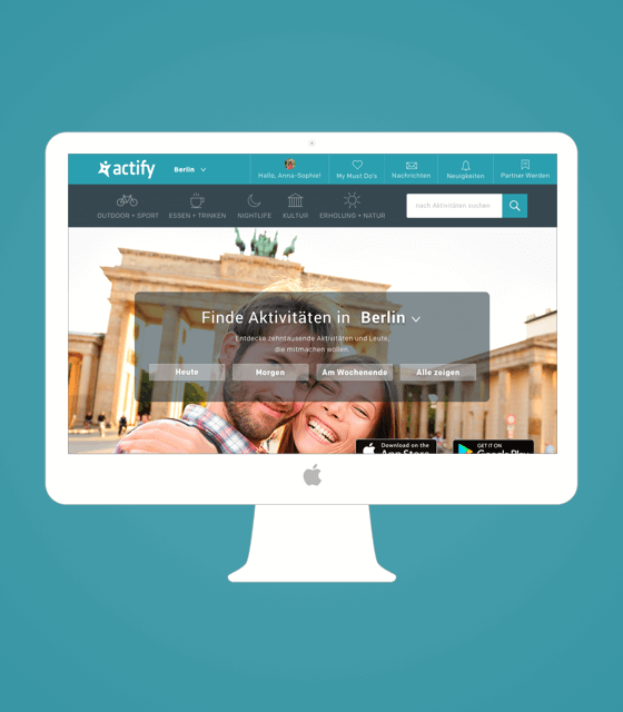
What we came up with was a modern, engaging and inspiring website with a lot of effective photography that we thought was the central element that would engage the users and encourage them to explore activities and participate. The flow we came up appears to be much more smooth and intuitive, the pages look clean and free of clutter. The rounder edges of most elements give the website a friendlier, more approachable look and feel.
